|
Investigations where students discover the relationship between variables can help students build a deeper understanding of functions. Often these explorations are hands on and engaging lessons. They typically start with some sort of interesting video or question prompt such as "What makes for an exciting bungee jump?" or "Which cup will keep my coffee warm the longest?". I was prompted to think about my favourite investigations after seeing a post from Nat Banting on Twitter. Below are a collection of links and descriptions of my favourite secondary mathematics investigations. Linear Relationships
Quadratic Relationships
Exponential Relationships
I like the investigation above because they share several common features.
Do you have a favourite activity or resource for activities? Please let me know what it is. EL
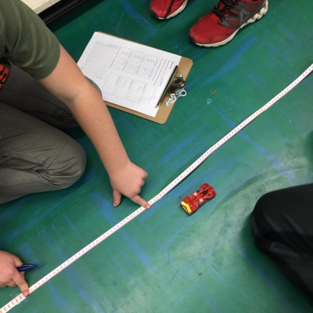
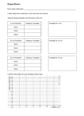
I was recently invited by a class to work with them on collecting and analysing data. After brainstorming some ideas with the classroom teacher, we settled on collecting data from pull back cars. I checked out Fawn Nguyen's Vroom Vroom lesson and Simon Job's Car Racing lesson to get some ideas on how to organize this lesson. We started the lesson by sharing the first half of Simon's video of cars racing across the floor. We had the students do some notice and wonder about the action taking place in the video and then introduced activity.
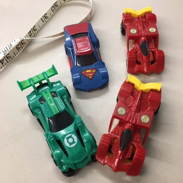
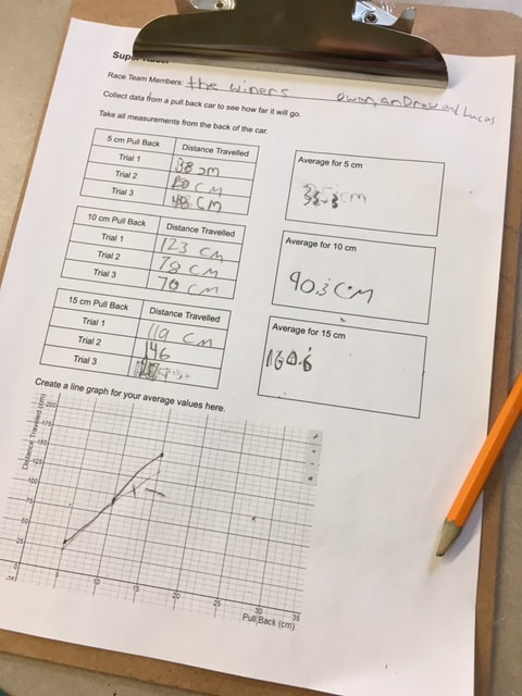
We showed students the recording sheet that we would be using and how we would be taking measurements (A link to the record sheet Google Doc is here). Then we brainstormed some ways to make sure that we all collected good data and avoided errors: we would all use the same units (centimeters), all measure our distances the same way (from the front bumper), not use data if the car bumped into a wall or a desk, etc. We split up into racing teams of three students each. Each group got a measuring tape, a pull back car and a recording sheet on a clip board.
The classroom teacher and I circulated the room (and a bit of the hallway) to help students and answer questions. After students finished collecting their data and plotting their values we came back together as a class. We asked several groups to plot their data on the whiteboard at the front of the room. We then had a discussion about general trends as well as why each car had a slightly different graph. Cars might have different wind up springs, different tire grip, dusty floors, aerodynamics, etc. 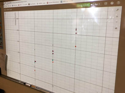 We finished the class with a bit of excitement... the 150 Challenge. Each team had to use the data for their car to predict how much they would need to pull back to make the car travel as close to 150 cm as possible. Teams huddled to interpret their data and select a pull back distance. Each team brought their car to the front of the class to give it their best shot. There was lots of cheering and excitement as some teams got very close. The winning distance was only 2.5 cm! Much closer than I had expected. This activity could be easily extended for higher grade levels by incorporating linear relationships, linear equations and linear regression. Nova Scotia Mathematics Curriculum Outcomes Mathematics 6 SP01 - Students will be expected to create, label, and interpret line graphs to draw conclusions. Mathematics 6 SP02 - Students will be expected to select, justify, and use appropriate methods of collecting data, including questionnaires, experiments, databases, and electronic media. Mathematics 6 SP03 - Students will be expected to graph collected data and analyze the graph to solve problems. Mathematics 9 PR02 - Students will be expected to graph a linear relation, analyze the graph, and interpolate or extrapolate to solve problems. Mathematics 10 RF07 - Determine the equation of a linear relation, given: a graph, a point and the slope, two points and a point and the equation of a parallel or perpendicular line to solve problems. (including RF07.06 Determine the equation of the line of best fit from a scatterplot using technology and determine the correlation) Mathematics Extended 11 S01 - Analyze, interpret, and draw conclusions from one-variable data using numerical and graphical summaries. EL
I recently did an activity with students to answer a question by collecting and analysing data. I was inspired by similar activities from Bruno Reddy, Mean Paper Aeroplanes, and Julie Reulbach, Paper Airplanes for Measures of Central Tendencies. We started class by watching a video of the Paper Airplane World Championship - Red Bull Paper Wings 2015. This short video (about 3 minutes) shows the highlights of three paper airplane competitions; Distance, Airtime, and Aerobatics. After watching the video I let students know that we would be making paper airplanes for a distance competition. Brainstorming
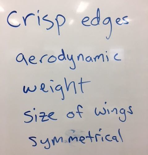
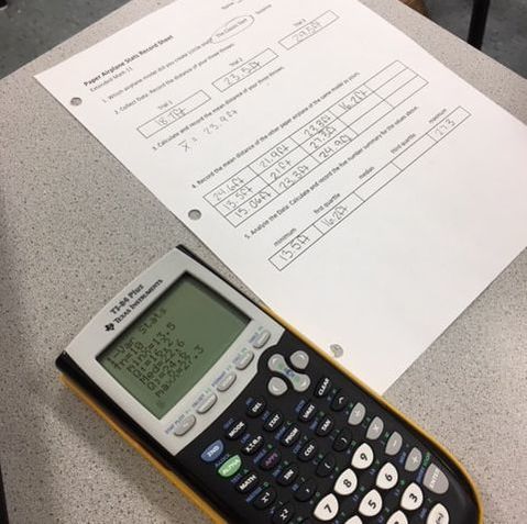
PredictionsNext I showed students two different paper airplane designs; the Suzanne and the Classic Dart. I asked students to predict which would fly the farthest. I also asked how much difference, if any, they expected to see between the two designs. Most students predicted that the Suzanne would fly farthest. The next step was to create an experiment in order to test our predictions. 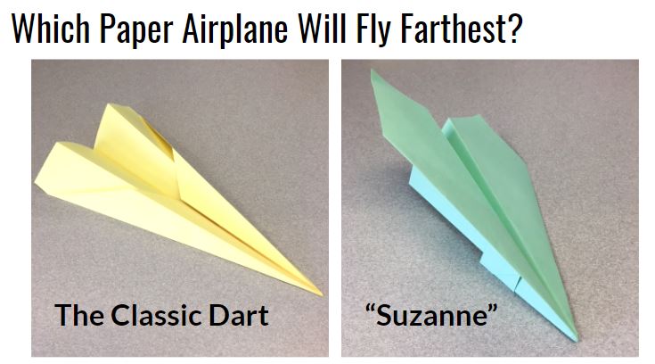 The ExperimentWe split the class in half. Each half followed a specific set of instructions to fold one or the other of these planes (I had a handout with instructions for each design). We used different coloured paper for each design. Each student threw their plane three times and recorded each flight distance. We measured in feet since the floor tiles in the hallway were one square foot. The students then calculated their mean distance and shared this mean with their team. Each team then calculated a five number summary and sketched a box plot for their data. The ResultsStudents declared the Suzanne to be the clear winner. The low ceiling height in the hallway seems to have favoured the glider design. We conjectured that the Dart may have performed better than Suzanne if they were thrown outdoors where students could throw at a higher launch angle. We also conjectured that the greater variation in the data for Suzanne was a result of the more complex folding required. Some planes were folded very well and others were a bit of a mess. 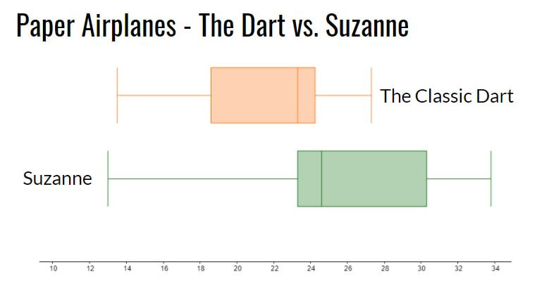 Reflection
We finished class by watching a video of the world record throw for distance (we just watched the first 3 minutes of the video). The Suzanne, designed by John Collins and thrown by football quarterback Joe Ayoob holds the Guinness World Record for the farthest flight by a paper aircraft. The record throw was 226 feet, 10 inches (approx. 69.14 m). Our longest flight was just over 40 feet. Students seemed to really enjoy this activity. It allowed them to incorporate some movement in class and asked them to use mathematics and statistics in an authentic way to answer a real question. Update 26 April 2022 - Looks like there may be a new world record paper airplane throw. An attempt from April 16, 2022 went 77.134m! https://www.youtube.com/watch?v=7Mdgta-0dtE Nova Scotia Mathematics Curriculum Outcomes Extended Mathematics 11 S01 - Analyze, interpret, and draw conclusions from one-variable data using numerical and graphical summaries. Mathematics 9 SP03 - Students will be expected to develop and implement a project plan for the collection, display, and analysis of data by: formulating a question for investigation; choosing a data collection method that includes social considerations; selecting a population or a sample; collecting the data; displaying the collected data in an appropriate manner; drawing conclusions to answer the question. EL
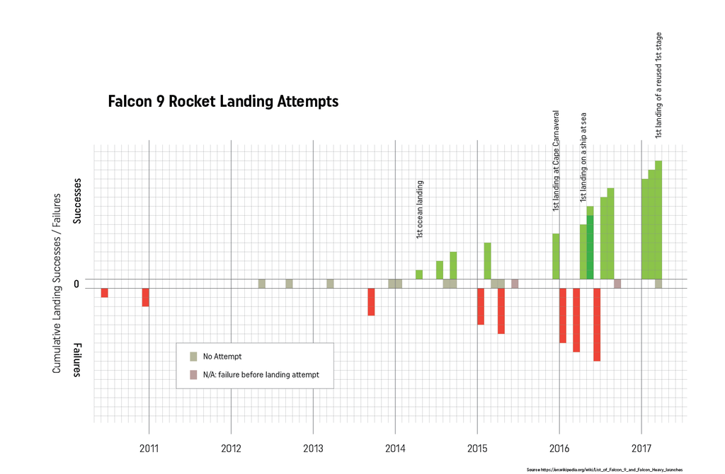
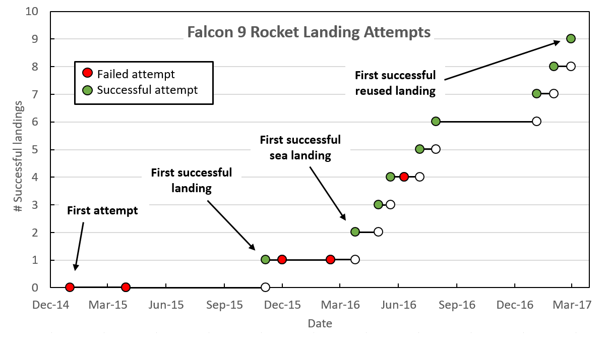
For anyone interested in data visualization, the r/dataisbeautiful subreddit is an amazing place to explore (you can also follow @DataIsBeautiful on Twitter). This subreddit has an active community of posters who create and discuss a wide variety of data visualizations. Shortly after the first successful landing by SpaceX of a reused Falcon 9 rocket, an incredible feat of engineering, the visualization below was created and shared by reddit user Brenden2016. 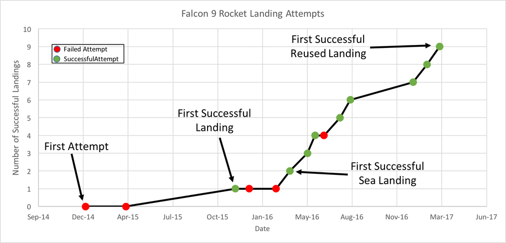 Even more interesting than the visualization was the discussion that followed. Over 200 comments (as I write this) have been posted regarding this visualization and suggestions of how to improve its powerful story of the increased efficiency and success of SpaceX Falcon 9 landings. Several issues emerged:
Additionally, two users created and posted alternate versions of the graph. One user, nicocote, created a double bar graph using additional launch data that didn't appear in the original. Another user, azura26, created a step graph instead of a line graph.
The full list of Falcon 9 landings can be found on the list of launches on Wikipedia. I took this data, summarized it and put it into a Google Sheets document to share (https://goo.gl/Ihr2Io). Please feel free to use it to generate your own data visualization or use it with students. In the ClassroomThis set of data appears to be a nice one to use in a classroom. It is a fairly small data set, is current and from the real world and (for me at least) is an engaging and interesting story. In a grade 8 classroom working on data presentation, I might start by showing the students some dramatic video of Falcon 9 boosters both crashing and landing successfully. Fiery explosions always make an impression! Then we could look at the data showing how SpaceX has done an impressive job of learning from their mistakes (and perhaps how this relates to a growth mindset in the mathematics classroom). We could then look at the data visualization from above and brainstorm, as a class, what features of the graph are positive and which could be improved. We could also answer the question, "what is the story this graph is trying to tell?" We could then break into groups, review that data and see if the groups could come up with a different way of telling that story using the data. Perhaps a different type of visualization or even an infographic could be created. What would you do with this data in your classroom? Please let me know. Nova Scotia Mathematics Curriculum Outcomes Grade 8 SP01 - Students will be expected to critique ways in which data is presented. Mathematics Essentials 11 F2 - Select an effective data display for a given set of data and explain the reasons for the choice. Mathematics at Work 11 S01 - Students will be expected to solve problems that involve creating and interpreting graphs, including bar graphs, histograms, line graphs, and circle graphs. EL
When I got home, I did a search to find out why the machines were gone and ran across a story from Global News. It turns out that TD Bank had decided to retire all the coin counting machines in Canada in the wake of reports from the U.S. that the machines were short-changing customers. In a segment on the Today Show called 'Rossen Reports', a team investigated the accuracy of a number of Coinstar machines as well as coin-counting machines at various branches of TD Bank. The team tested the accuracy of the machines by carefully preparing bags filled with exactly $300 worth of pennies, nickles, dimes and quarters. They then used the machines to see how close their count was to $300. The Coinstar machines all checked out with the correct $300 total. The TD Bank machines did not fare so well. The totals on the machines tested at 5 different branches were: $299.95, $299.47, $299.30, $296.27 and $256.90. None of the machines returned an accurate $300 count. I don't think that machines can really be "100% accurate" all the time. What level of accuracy do you think is acceptable from a coin-counting machine? How much time does it take to roll $300 worth of coins and how much is your time worth? I would probably accept $299.95 for the convenience of not having to roll that many coins. I would be a bit more hesitant to accept $296.27 and definitely would not accept $256.90. While the TD Bank machines were free for customers, in Canada, Coinstar machines apply a coin counting fee of 11.9 cents per dollar. For the $300 counted in this test, the fee would have been $35.70. That is a pretty hefty fee. Questions and EstimationsAccording to a class action lawsuit filed in New York in April 2016, TD’s coin-counting machines processed 29 billion coins in 2012. Based on this figure and the data collected by the Rossen Report, how much money do you think customers lost? What factors did you consider when making this estimate? How would you design an experiment to test the accuracy of TD's coin counting machines? Would you test lots of different machines or a few machines multiple times? How many trials would you run to be confident in your results? What factors might contribute to the errors discovered in these machines? Nova Scotia Mathematics Curriculum Outcomes Mathematics 11 S02 - Interpret statistical data, using: confidence intervals, confidence levels and margin of error. Mathematics 11 S03 - Critically analyze society’s use of statistics. Grade 9 SP03 - Students will be expected to develop and implement a project plan for the collection, display, and analysis of data by: formulating a question for investigation; choosing a data collection method that includes social considerations; selecting a population or a sample; collecting the data; displaying the collected data in an appropriate manner; drawing conclusions to answer the question. Grade 7 SP06 - Students will be expected to conduct a probability experiment to compare the theoretical probability (determined using a tree diagram, table, or other graphic organizer) and experimental probability of two independent events. EL
I recently visited Memory Lane Heritage Village in Lake Charlotte. It is a living history museum depicting coastal rural life in Nova Scotia during the 1940s. My five year old son had a great time. He especially enjoyed sitting in the 1928 Ford Model A car and pretending to drive. On the way back home I was thinking about other living history museums in Nova Scotia and realized that, based on my experience, it appears that the further away from my home in Halifax that I drive, the farther back in time the museums depict. When I got home, I dug up some data. Sherbrooke Village depicts a typical Nova Scotian village from the 1860s and the Fortress of Louisbourg allows you to experience life in Louisbourg during the 1740s. 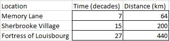 I used Google Maps to find the driving distance from my house to each of these locations and discovered a nearly perfect linear relationship. How perfect you ask? The correlation coefficient was 0.99906. I quickly created a scatter plot with a line of best fit to show my wife. Despite my exuberance, she appeared to remain unimpressed. 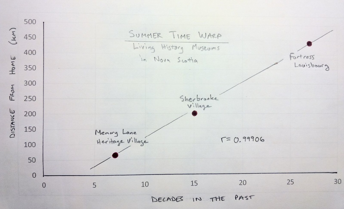 It is also interesting to see that the points on the scatter plot are almost exactly where the sites are on a map of Nova Scotia as well. Mind Blown. 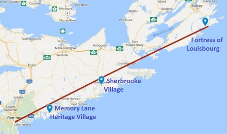 A question that I still have is whether this apparent temporal relationship is based on distance or displacement. Perhaps I need to collect some additional data (or not intentionally disregard data that doesn't fit my hypothesis)? If I travel in the opposite direction, should a living history museum depict life in the past or in the future? I'd love to visit Yarmouth some day to experience what life will be like in rural Nova Scotia in the year 2213! EL
The Sno Cap Drive In in Sisters, Oregon is a diner that serves homemade ice cream and old fashioned burgers. The food here is great and the homemade ice cream is delicious. I stopped in this summer for a scoop of Cookie Monster ice cream. While waiting in line, I had some time to notice and wonder about the prices listed on the menu. What is going on here? 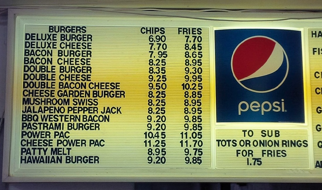 NoticingI noticed the differences in price between having your burger with potato chips or with french fries. Depending on the burger you're having, it costs anywhere from 45¢ to 95¢ more to have fries instead of chips. I also noticed the difference between the burgers with cheese and those without cheese. To add cheese to your deluxe burger is an additional 80¢ but to add cheese to your bacon burger is only an additional 30¢. WonderingIs there a pattern or rule to the price differences between having a burger with chips or fries? The list of differences between chips and fries is: 70¢, 70¢, 65¢, 60¢, 45¢, 80¢, 75¢, 75¢, 95¢, 70¢, 65¢, 70¢, 70¢, 65¢, 80¢, 60¢. The values range from a minimum of 45¢ to a maximum of 95¢. The mean difference is 70¢ and the standard deviation (a measure of variation) is 11¢. I tried sorting the burgers in a variety of ways but there appears to be no pattern to the difference in price between chips and fries. This restaurant is in Oregon, which has no sales tax (one of only five such states), so the prices are not set so that when tax is applied, the total is a round number. I'm assuming that every burger gets the same amount of fries, but perhaps this isn't the case. I wonder if they get many questions about this? If you wanted to give the prices on this menu an overhaul, how would you price these burgers, chips and fries? Could you come up with a more logical system of pricing? What factors would go into making these price decisions? Which burger do you think is currently the most profitable based on the current prices? 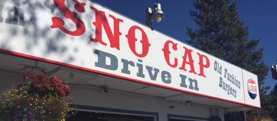 Nova Scotia Mathematics Curriculum Outcomes Grade 7 SP01 - Students will be expected to demonstrate an understanding of central tendency and range by: determining the measures of central tendency (mean, median, mode) and range; determining the most appropriate measures of central tendency to report findings. Grade 7 N02 - Students will be expected to demonstrate an understanding of the addition, subtraction, multiplication and division of decimals to solve problems (for more than one-digit divisors or more than two-digit multipliers, the use of technology is expected). Mathematics 11 S01 - Demonstrate an understanding of normal distribution, including: standard deviation and z-scores. EL
|
Categories
All
|
 RSS Feed