|
Investigations where students discover the relationship between variables can help students build a deeper understanding of functions. Often these explorations are hands on and engaging lessons. They typically start with some sort of interesting video or question prompt such as "What makes for an exciting bungee jump?" or "Which cup will keep my coffee warm the longest?". I was prompted to think about my favourite investigations after seeing a post from Nat Banting on Twitter. Below are a collection of links and descriptions of my favourite secondary mathematics investigations. Linear Relationships
Quadratic Relationships
Exponential Relationships
I like the investigation above because they share several common features.
Do you have a favourite activity or resource for activities? Please let me know what it is. EL
I was recently looking for an activity to explore a linear relationship, preferable one that included some practice with decimals. I found a few examples but none of them really seemed to satisfy what I was looking for. Here are a few of my criteria for good experiments to explore function relationships:
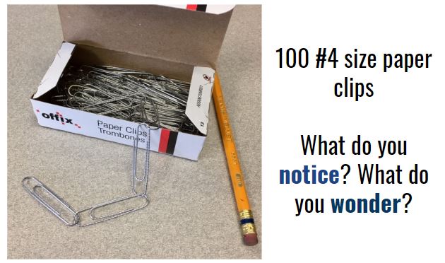
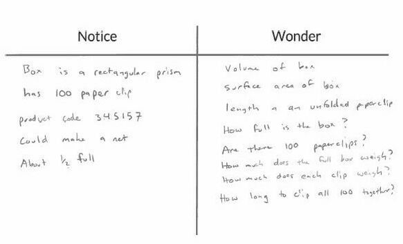
Notice and Wonder
There were some great questions about volume and surface area, weight, and size of the paper clips (what is a #4 sized paper clip?). The questions the we went on to investigate was how long would it take to make a paper clip chain from all 100 paper clips. I was inspired by Dan Meyer's Guinness World Record for the longest paperclip chain in 24 hours. Dan blogged about breaking the record as well as asking student to see how many paperclips they could chain in one minute. Estimation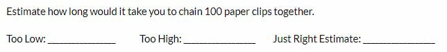 I asked students to estimate how long they thought it would take to create a chain of 100 paper clips. I also asked them to think about an estimate that they know was too low (that creating a chain this fast was not possible) and too high (that they would have no problem creating a chain in this time even going slowly). Most students thought that a time between 5 and 6 minutes was a good "just right" estimate. Gathering Data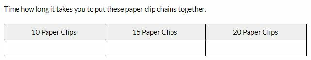
Revising EstimatesAfter collecting and analyzing some data, I ask students if they'd like to revise their estimate for 100 paper clips. Then we test their revised estimate using a plot of the values they collected and extrapolating. Below is one student's data plotted in Desmos. They estimated 300 seconds (5 minutes) to chain all 100 paperclips. 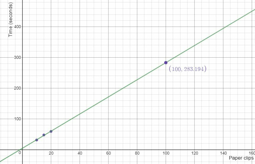 This lesson could be modified to include outcomes from a number of different grade levels. I closed the lesson by showing students the record for the most paper clips linked together in one minute and asked students how they would compare. Nova Scotia Mathematics Curriculum Outcomes Mathematics 6 SP01 - Students will be expected to create, label, and interpret line graphs to draw conclusions. Mathematics 6 SP02 - Students will be expected to select, justify, and use appropriate methods of collecting data, including questionnaires, experiments, databases, and electronic media. Mathematics 6 SP03 - Students will be expected to graph collected data and analyze the graph to solve problems. Mathematics 7 PR02 - Students will be expected to create a table of values from a linear relation, graph the table of values, and analyze the graph to draw conclusions and solve problems. Mathematics 7 N02 - Students will be expected to demonstrate an understanding of the addition, subtraction, multiplication and division of decimals to solve problems (for more than one-digit divisors or more than two-digit multipliers, the use of technology is expected). Mathematics 7 SP01 - Students will be expected to demonstrate an understanding of central tendency and range by: determining the measures of central tendency (mean, median, mode) and range; determining the most appropriate measures of central tendency to report findings. Mathematics 7 SP02 - Students will be expected to determine the effect on the mean, median, and mode when an outlier is included in a data set. EL
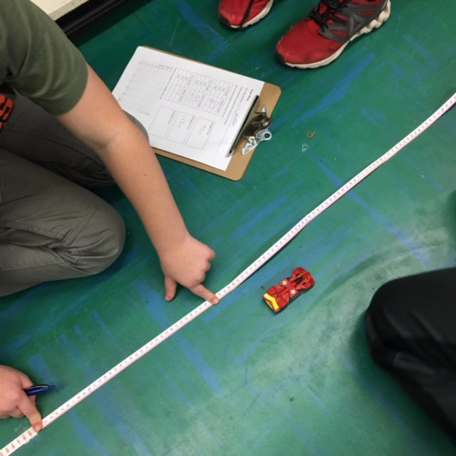
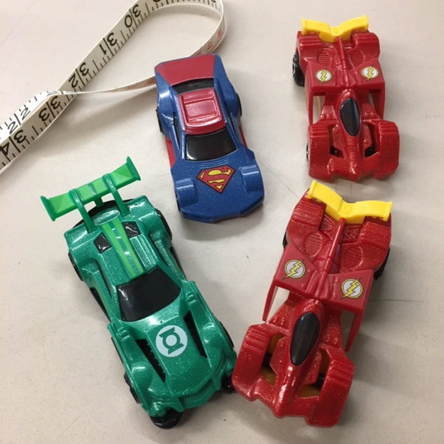
I was recently invited by a class to work with them on collecting and analysing data. After brainstorming some ideas with the classroom teacher, we settled on collecting data from pull back cars. I checked out Fawn Nguyen's Vroom Vroom lesson and Simon Job's Car Racing lesson to get some ideas on how to organize this lesson. We started the lesson by sharing the first half of Simon's video of cars racing across the floor. We had the students do some notice and wonder about the action taking place in the video and then introduced activity.
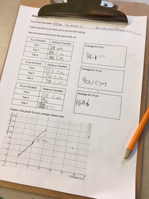
We showed students the recording sheet that we would be using and how we would be taking measurements (A link to the record sheet Google Doc is here). Then we brainstormed some ways to make sure that we all collected good data and avoided errors: we would all use the same units (centimeters), all measure our distances the same way (from the front bumper), not use data if the car bumped into a wall or a desk, etc. We split up into racing teams of three students each. Each group got a measuring tape, a pull back car and a recording sheet on a clip board.
The classroom teacher and I circulated the room (and a bit of the hallway) to help students and answer questions. After students finished collecting their data and plotting their values we came back together as a class. We asked several groups to plot their data on the whiteboard at the front of the room. We then had a discussion about general trends as well as why each car had a slightly different graph. Cars might have different wind up springs, different tire grip, dusty floors, aerodynamics, etc. 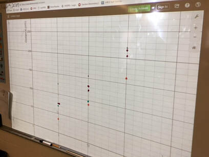 We finished the class with a bit of excitement... the 150 Challenge. Each team had to use the data for their car to predict how much they would need to pull back to make the car travel as close to 150 cm as possible. Teams huddled to interpret their data and select a pull back distance. Each team brought their car to the front of the class to give it their best shot. There was lots of cheering and excitement as some teams got very close. The winning distance was only 2.5 cm! Much closer than I had expected. This activity could be easily extended for higher grade levels by incorporating linear relationships, linear equations and linear regression. Nova Scotia Mathematics Curriculum Outcomes Mathematics 6 SP01 - Students will be expected to create, label, and interpret line graphs to draw conclusions. Mathematics 6 SP02 - Students will be expected to select, justify, and use appropriate methods of collecting data, including questionnaires, experiments, databases, and electronic media. Mathematics 6 SP03 - Students will be expected to graph collected data and analyze the graph to solve problems. Mathematics 9 PR02 - Students will be expected to graph a linear relation, analyze the graph, and interpolate or extrapolate to solve problems. Mathematics 10 RF07 - Determine the equation of a linear relation, given: a graph, a point and the slope, two points and a point and the equation of a parallel or perpendicular line to solve problems. (including RF07.06 Determine the equation of the line of best fit from a scatterplot using technology and determine the correlation) Mathematics Extended 11 S01 - Analyze, interpret, and draw conclusions from one-variable data using numerical and graphical summaries. EL
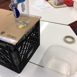
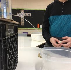
I recently had the opportunity to work with a student to investigate parabolas and quadratic functions. We used one activity to investigate two different quadratic relationships. First we observed the shape of the stream of water coming out the side of a water bottle and then we observed the rate the water drains. The Water FountainI set up a cylindrical bottle of water on a crate. The bottle had a whole in it covered with a piece of tape. I asked students for some predictions. What will the shape of the water coming out of the side of the water bottle look like. What will happens to the stream of water as the water level goes down?
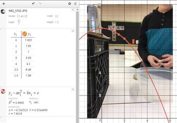
I noticed that the student drew the water stream coming out of the bottle like it comes out of a water fountain (where we had just filled the bottle). We took the tape off the hole and then watched the water come out while making some observations and taking some photos. We selected a good photo (the black bulletin board in the background really helped) and loaded into Desmos. Then we used a table to record some points along the steam of water. After that we did a linear and then a quadratic regression on the point to see that the parabola was a much better fit than a line. We then had a chat about parabolas and projectile motion.
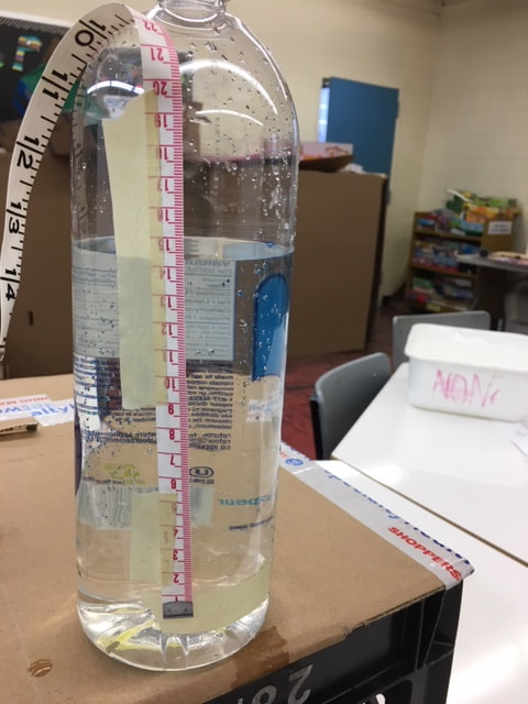
Draining the TankWe set up the water bottle again but this time instead of looking at the shape of the stream of water, we focused on how fast the water level fell. I asked the student to predict what this might look like. You might ask students to predict what a graph of the water level might look like over time for the two situations below. How would the graph look when filling the tank compared to emptying the tank? 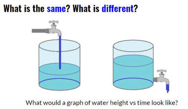 The water flowing into a tank should rise at a linear rate. Students should expect that when the water drains from an open tank, the flow will be greatest at first and then gradually decrease as the water level decreases. (This is an application of Torricelli's Law). Next we taped a measuring tape to the side of the bottle and collected some data as the water flowed out of the bottle (A similar experiment is described in Canavan-McGrath, Foundations of Mathematics 12, 429). We used the stopwatch on my cell phone to record the time at each centimeter of height. This wasn't as accurate as I had hoped due to some distractions in the room. We set up the experiment again and the second time I recorded the water falling using a video (I used the CoachMyVideo app). We were able to get much more accurate values this way.
We entered the data in a table on Desmos and then did a quadratic regression to fit a curve to our points. I was a bit surprised at how well the data from the video analysis on our second attempt fit to a quadratic curve (R^2 = 0.9999. 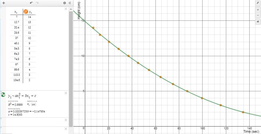 I really liked how we could use the exact same setup to investigate two different quadratic relationships. Nova Scotia Mathematics Curriculum Outcomes Mathematics 11 RF02 - Demonstrate an understanding of the characteristics of quadratic functions, including: vertex, intercepts, domain and range and the axis of symmetry. Pre-calculus 11 RF04 - Students will be expected to analyze quadratic functions of the form y = ax^2 + bx + c to identify characteristics of the corresponding graph, including vertex, domain and range, direction of opening, axis of symmetry, x-intercept and y-intercept, and to solve problems. EL
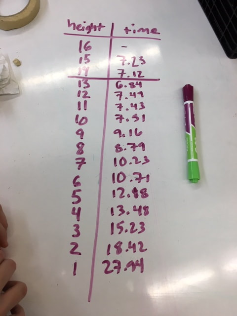
I recently did an activity with students to answer a question by collecting and analysing data. I was inspired by similar activities from Bruno Reddy, Mean Paper Aeroplanes, and Julie Reulbach, Paper Airplanes for Measures of Central Tendencies. We started class by watching a video of the Paper Airplane World Championship - Red Bull Paper Wings 2015. This short video (about 3 minutes) shows the highlights of three paper airplane competitions; Distance, Airtime, and Aerobatics. After watching the video I let students know that we would be making paper airplanes for a distance competition. Brainstorming
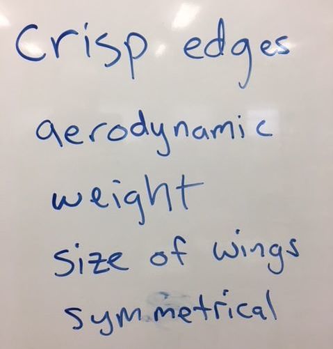
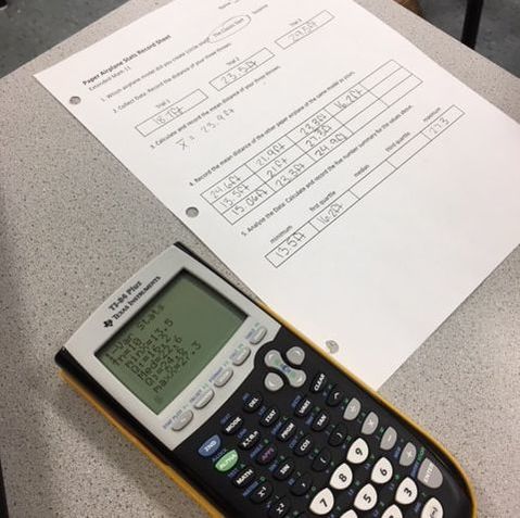
PredictionsNext I showed students two different paper airplane designs; the Suzanne and the Classic Dart. I asked students to predict which would fly the farthest. I also asked how much difference, if any, they expected to see between the two designs. Most students predicted that the Suzanne would fly farthest. The next step was to create an experiment in order to test our predictions. 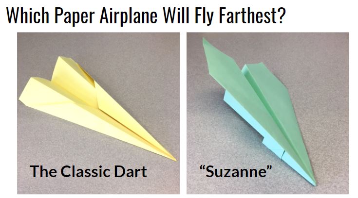 The ExperimentWe split the class in half. Each half followed a specific set of instructions to fold one or the other of these planes (I had a handout with instructions for each design). We used different coloured paper for each design. Each student threw their plane three times and recorded each flight distance. We measured in feet since the floor tiles in the hallway were one square foot. The students then calculated their mean distance and shared this mean with their team. Each team then calculated a five number summary and sketched a box plot for their data. The ResultsStudents declared the Suzanne to be the clear winner. The low ceiling height in the hallway seems to have favoured the glider design. We conjectured that the Dart may have performed better than Suzanne if they were thrown outdoors where students could throw at a higher launch angle. We also conjectured that the greater variation in the data for Suzanne was a result of the more complex folding required. Some planes were folded very well and others were a bit of a mess. 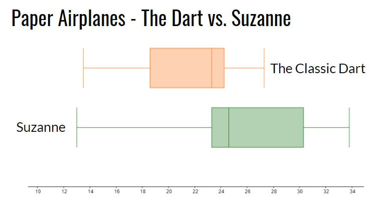 Reflection
We finished class by watching a video of the world record throw for distance (we just watched the first 3 minutes of the video). The Suzanne, designed by John Collins and thrown by football quarterback Joe Ayoob holds the Guinness World Record for the farthest flight by a paper aircraft. The record throw was 226 feet, 10 inches (approx. 69.14 m). Our longest flight was just over 40 feet. Students seemed to really enjoy this activity. It allowed them to incorporate some movement in class and asked them to use mathematics and statistics in an authentic way to answer a real question. Update 26 April 2022 - Looks like there may be a new world record paper airplane throw. An attempt from April 16, 2022 went 77.134m! https://www.youtube.com/watch?v=7Mdgta-0dtE Nova Scotia Mathematics Curriculum Outcomes Extended Mathematics 11 S01 - Analyze, interpret, and draw conclusions from one-variable data using numerical and graphical summaries. Mathematics 9 SP03 - Students will be expected to develop and implement a project plan for the collection, display, and analysis of data by: formulating a question for investigation; choosing a data collection method that includes social considerations; selecting a population or a sample; collecting the data; displaying the collected data in an appropriate manner; drawing conclusions to answer the question. EL
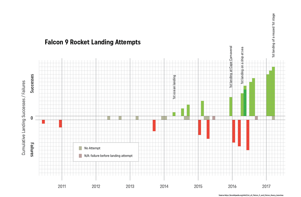
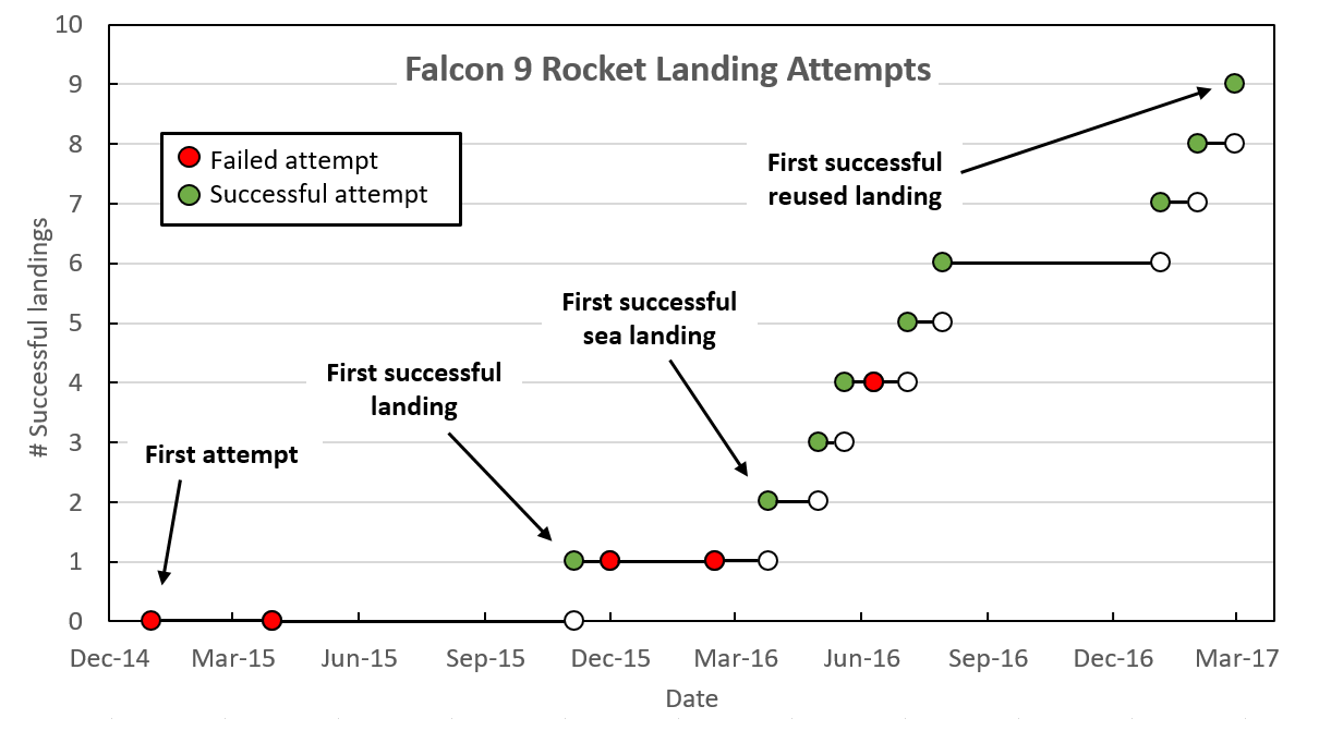
For anyone interested in data visualization, the r/dataisbeautiful subreddit is an amazing place to explore (you can also follow @DataIsBeautiful on Twitter). This subreddit has an active community of posters who create and discuss a wide variety of data visualizations. Shortly after the first successful landing by SpaceX of a reused Falcon 9 rocket, an incredible feat of engineering, the visualization below was created and shared by reddit user Brenden2016. 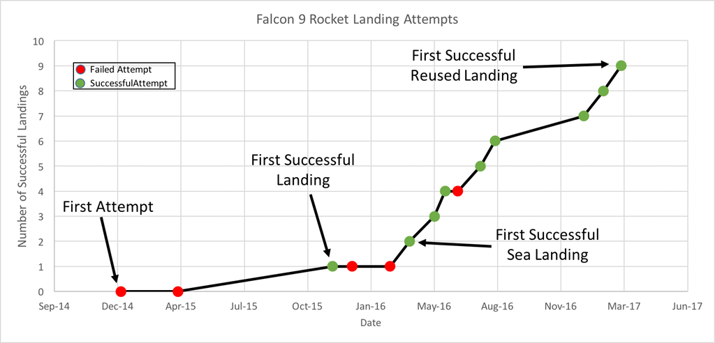 Even more interesting than the visualization was the discussion that followed. Over 200 comments (as I write this) have been posted regarding this visualization and suggestions of how to improve its powerful story of the increased efficiency and success of SpaceX Falcon 9 landings. Several issues emerged:
Additionally, two users created and posted alternate versions of the graph. One user, nicocote, created a double bar graph using additional launch data that didn't appear in the original. Another user, azura26, created a step graph instead of a line graph.
The full list of Falcon 9 landings can be found on the list of launches on Wikipedia. I took this data, summarized it and put it into a Google Sheets document to share (https://goo.gl/Ihr2Io). Please feel free to use it to generate your own data visualization or use it with students. In the ClassroomThis set of data appears to be a nice one to use in a classroom. It is a fairly small data set, is current and from the real world and (for me at least) is an engaging and interesting story. In a grade 8 classroom working on data presentation, I might start by showing the students some dramatic video of Falcon 9 boosters both crashing and landing successfully. Fiery explosions always make an impression! Then we could look at the data showing how SpaceX has done an impressive job of learning from their mistakes (and perhaps how this relates to a growth mindset in the mathematics classroom). We could then look at the data visualization from above and brainstorm, as a class, what features of the graph are positive and which could be improved. We could also answer the question, "what is the story this graph is trying to tell?" We could then break into groups, review that data and see if the groups could come up with a different way of telling that story using the data. Perhaps a different type of visualization or even an infographic could be created. What would you do with this data in your classroom? Please let me know. Nova Scotia Mathematics Curriculum Outcomes Grade 8 SP01 - Students will be expected to critique ways in which data is presented. Mathematics Essentials 11 F2 - Select an effective data display for a given set of data and explain the reasons for the choice. Mathematics at Work 11 S01 - Students will be expected to solve problems that involve creating and interpreting graphs, including bar graphs, histograms, line graphs, and circle graphs. EL
I recently visited Memory Lane Heritage Village in Lake Charlotte. It is a living history museum depicting coastal rural life in Nova Scotia during the 1940s. My five year old son had a great time. He especially enjoyed sitting in the 1928 Ford Model A car and pretending to drive. On the way back home I was thinking about other living history museums in Nova Scotia and realized that, based on my experience, it appears that the further away from my home in Halifax that I drive, the farther back in time the museums depict. When I got home, I dug up some data. Sherbrooke Village depicts a typical Nova Scotian village from the 1860s and the Fortress of Louisbourg allows you to experience life in Louisbourg during the 1740s.  I used Google Maps to find the driving distance from my house to each of these locations and discovered a nearly perfect linear relationship. How perfect you ask? The correlation coefficient was 0.99906. I quickly created a scatter plot with a line of best fit to show my wife. Despite my exuberance, she appeared to remain unimpressed. 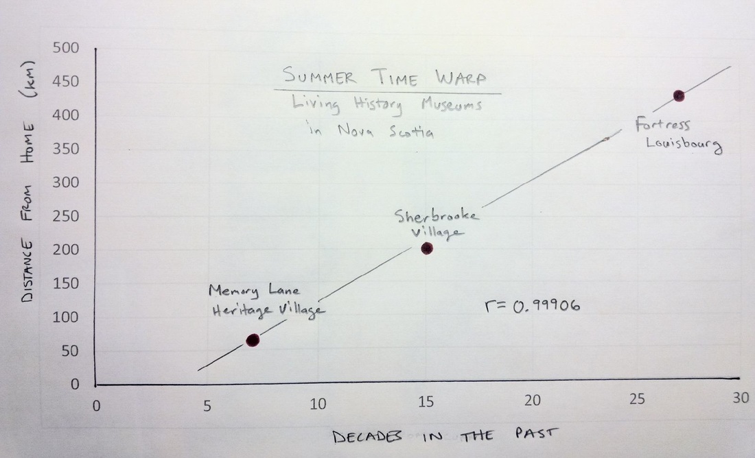 It is also interesting to see that the points on the scatter plot are almost exactly where the sites are on a map of Nova Scotia as well. Mind Blown. 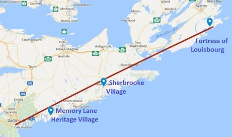 A question that I still have is whether this apparent temporal relationship is based on distance or displacement. Perhaps I need to collect some additional data (or not intentionally disregard data that doesn't fit my hypothesis)? If I travel in the opposite direction, should a living history museum depict life in the past or in the future? I'd love to visit Yarmouth some day to experience what life will be like in rural Nova Scotia in the year 2213! EL
|
Categories
All
|
 RSS Feed