|
I recently did an activity with students to answer a question by collecting and analysing data. I was inspired by similar activities from Bruno Reddy, Mean Paper Aeroplanes, and Julie Reulbach, Paper Airplanes for Measures of Central Tendencies. We started class by watching a video of the Paper Airplane World Championship - Red Bull Paper Wings 2015. This short video (about 3 minutes) shows the highlights of three paper airplane competitions; Distance, Airtime, and Aerobatics. After watching the video I let students know that we would be making paper airplanes for a distance competition. Brainstorming
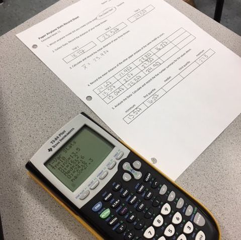
PredictionsNext I showed students two different paper airplane designs; the Suzanne and the Classic Dart. I asked students to predict which would fly the farthest. I also asked how much difference, if any, they expected to see between the two designs. Most students predicted that the Suzanne would fly farthest. The next step was to create an experiment in order to test our predictions. 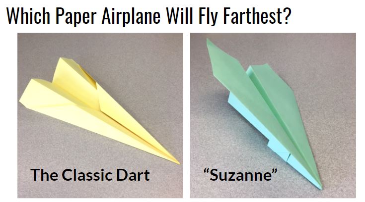 The ExperimentWe split the class in half. Each half followed a specific set of instructions to fold one or the other of these planes (I had a handout with instructions for each design). We used different coloured paper for each design. Each student threw their plane three times and recorded each flight distance. We measured in feet since the floor tiles in the hallway were one square foot. The students then calculated their mean distance and shared this mean with their team. Each team then calculated a five number summary and sketched a box plot for their data. The ResultsStudents declared the Suzanne to be the clear winner. The low ceiling height in the hallway seems to have favoured the glider design. We conjectured that the Dart may have performed better than Suzanne if they were thrown outdoors where students could throw at a higher launch angle. We also conjectured that the greater variation in the data for Suzanne was a result of the more complex folding required. Some planes were folded very well and others were a bit of a mess. 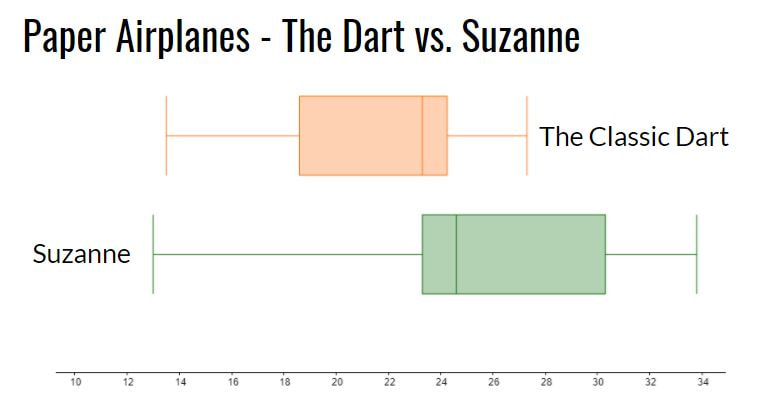 Reflection
We finished class by watching a video of the world record throw for distance (we just watched the first 3 minutes of the video). The Suzanne, designed by John Collins and thrown by football quarterback Joe Ayoob holds the Guinness World Record for the farthest flight by a paper aircraft. The record throw was 226 feet, 10 inches (approx. 69.14 m). Our longest flight was just over 40 feet. Students seemed to really enjoy this activity. It allowed them to incorporate some movement in class and asked them to use mathematics and statistics in an authentic way to answer a real question. Update 26 April 2022 - Looks like there may be a new world record paper airplane throw. An attempt from April 16, 2022 went 77.134m! https://www.youtube.com/watch?v=7Mdgta-0dtE Nova Scotia Mathematics Curriculum Outcomes Extended Mathematics 11 S01 - Analyze, interpret, and draw conclusions from one-variable data using numerical and graphical summaries. Mathematics 9 SP03 - Students will be expected to develop and implement a project plan for the collection, display, and analysis of data by: formulating a question for investigation; choosing a data collection method that includes social considerations; selecting a population or a sample; collecting the data; displaying the collected data in an appropriate manner; drawing conclusions to answer the question. EL
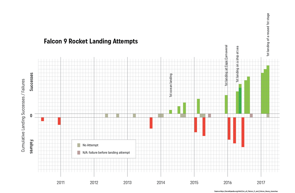
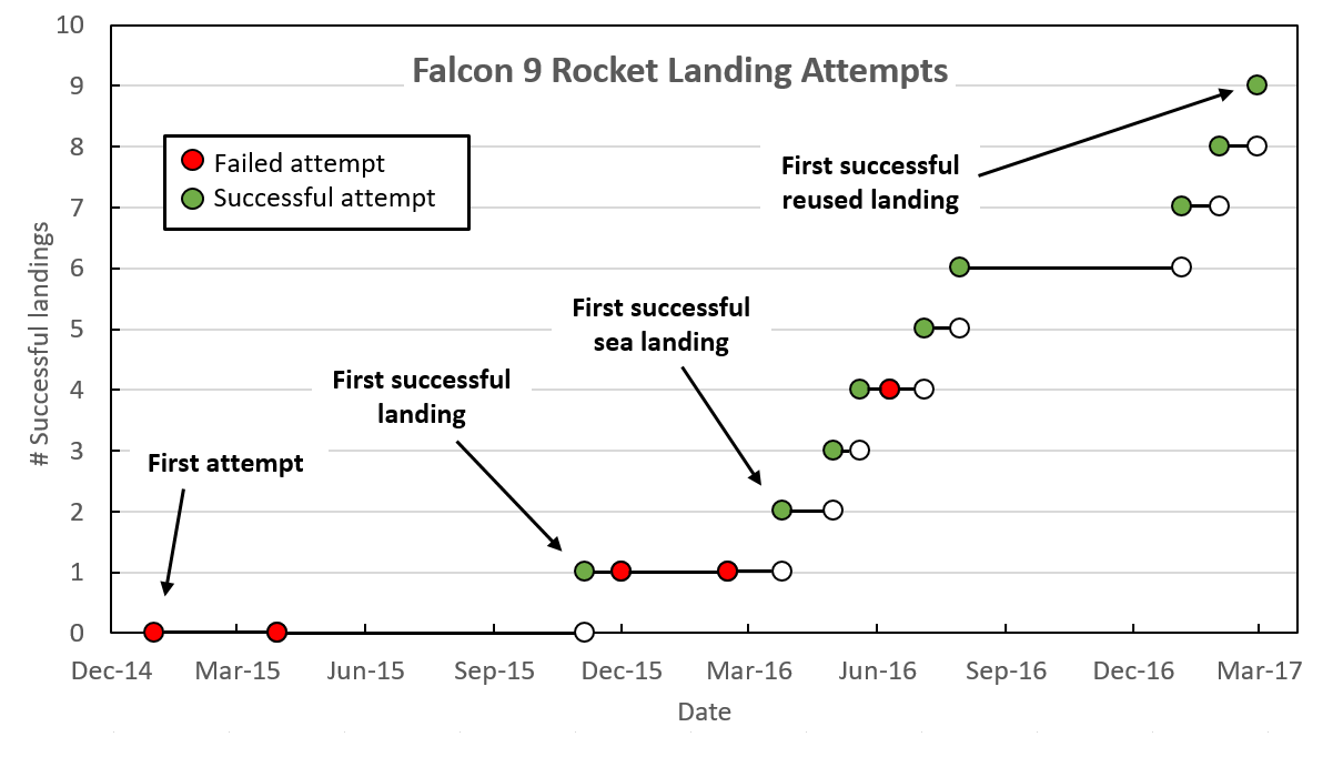
For anyone interested in data visualization, the r/dataisbeautiful subreddit is an amazing place to explore (you can also follow @DataIsBeautiful on Twitter). This subreddit has an active community of posters who create and discuss a wide variety of data visualizations. Shortly after the first successful landing by SpaceX of a reused Falcon 9 rocket, an incredible feat of engineering, the visualization below was created and shared by reddit user Brenden2016. 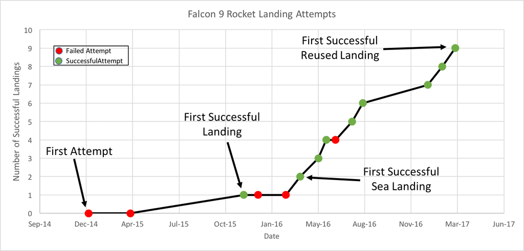 Even more interesting than the visualization was the discussion that followed. Over 200 comments (as I write this) have been posted regarding this visualization and suggestions of how to improve its powerful story of the increased efficiency and success of SpaceX Falcon 9 landings. Several issues emerged:
Additionally, two users created and posted alternate versions of the graph. One user, nicocote, created a double bar graph using additional launch data that didn't appear in the original. Another user, azura26, created a step graph instead of a line graph.
The full list of Falcon 9 landings can be found on the list of launches on Wikipedia. I took this data, summarized it and put it into a Google Sheets document to share (https://goo.gl/Ihr2Io). Please feel free to use it to generate your own data visualization or use it with students. In the ClassroomThis set of data appears to be a nice one to use in a classroom. It is a fairly small data set, is current and from the real world and (for me at least) is an engaging and interesting story. In a grade 8 classroom working on data presentation, I might start by showing the students some dramatic video of Falcon 9 boosters both crashing and landing successfully. Fiery explosions always make an impression! Then we could look at the data showing how SpaceX has done an impressive job of learning from their mistakes (and perhaps how this relates to a growth mindset in the mathematics classroom). We could then look at the data visualization from above and brainstorm, as a class, what features of the graph are positive and which could be improved. We could also answer the question, "what is the story this graph is trying to tell?" We could then break into groups, review that data and see if the groups could come up with a different way of telling that story using the data. Perhaps a different type of visualization or even an infographic could be created. What would you do with this data in your classroom? Please let me know. Nova Scotia Mathematics Curriculum Outcomes Grade 8 SP01 - Students will be expected to critique ways in which data is presented. Mathematics Essentials 11 F2 - Select an effective data display for a given set of data and explain the reasons for the choice. Mathematics at Work 11 S01 - Students will be expected to solve problems that involve creating and interpreting graphs, including bar graphs, histograms, line graphs, and circle graphs. EL
|
Categories
All
|
 RSS Feed